[cross-reference to target(s) "ccog-domain-of-rational-functions" missing or not unique]
In this chapter we will learn about rational functions, which are ratios of two polynomial functions. Creating this ratio inherently requires division, and we’ll explore the effect this has on the graphs of rational functions and their domain and range.
Figure12.1.1.Alternative Video Lesson
Subsection12.1.1Graphs of Rational Functions
Example12.1.2.
When a drug is injected into a patient, the drug’s concentration in the patient’s bloodstream can be modeled by the function \(C\text{,}\) with formula
where \(C(t)\) gives the drug’s concentration, in milligrams per liter, \(t\) hours since the injection. A new injection is needed when the concentration falls to \(0.35\) milligrams per liter. Using graphing technology, we will graph \(y=\frac{3t}{t^2+8}\) and \(y=0.35\) to examine the situation and answer some important questions.
Figure12.1.3.Graph of \(C(t)=\frac{3t}{t^2+8}\)
What is the concentration after 10 hours?
After how many hours since the first injection is the drug concentration greatest?
After how many hours since the first injection should the next injection be given?
What happens to the drug concentration if no further injections are given?
Explanation.
To determine the concentration after 10 hours, we will evaluate \(C\) at \(t=10\text{.}\) After \(10\) hours, the concentration will be about 0.2777 mg⁄L.
Using the graph, we can see that the maximum concentration of the drug will be 0.53 mg⁄L and will occur after about \(2.828\) hours.
The approximate points of intersection \((1.066,0.35)\) and \((7.506,0.35)\) tell us that the concentration of the drug will reach 0.35 mg⁄L after about \(1.066\) hours and again after about \(7.506\) hours. Given the rising, then falling shape of the graph, this means that another dose will need to be administered after about \(7.506\) hours.
From the initial graph, it appears that the concentration of the drug will diminish to zero with enough time passing. Exploring further, we can see both numerically and graphically that for larger and larger values of \(t\text{,}\) the function values get closer and closer to zero. This is shown in Figure 4 and Figure 5.
\(t\)
\(C(t)\)
\(24\)
\(0.123\ldots\)
\(48\)
\(0.062\ldots\)
\(72\)
\(0.041\ldots\)
\(96\)
\(0.031\ldots\)
\(120\)
\(0.020\ldots\)
Figure12.1.4.Numerical Values for \(C(t)=\frac{3t}{t^2+8}\)
Figure12.1.5.Graph of \(C(t)=\frac{3t}{t^2+8}\)
In Section 5, we’ll explore how to algebraically solve \(C(t)=0.35\text{.}\) For now, we will rely on technology to make the graph and determine intersection points.
The function \(C\text{,}\) where \(C(t)=\frac{3t}{t^2+8}\text{,}\) is a rational function, which is a type of function defined as follows.
Definition12.1.6.Rational Function.
A rational function \(f\) is a function in the form
where \(P\) and \(Q\) are polynomial functions, but \(Q\) is not the constant zero function.
Checkpoint12.1.7.
Identify which of the following are rational functions and which are not.
\(f\) defined by \(f(x)=\frac{25x^2+3}{25x^2+3}\)
?
is
is not
a rational function.
\(Q\) defined by \(Q(x)=\frac{5x^2+3\sqrt{x}}{2x}\)
?
is
is not
a rational function.
\(g\) defined by \(g(t)=\frac{t\sqrt{5} -t^3}{2t+1}\)
?
is
is not
a rational function.
\(P\) defined by \(P(x)=\frac{5x+3}{\abs{2x+1}}\)
?
is
is not
a rational function.
\(h\) defined by \(h(x)=\frac{3^x+1}{x^2+1}\)
?
is
is not
a rational function.
Explanation.
\(f\) defined by \(f(x)=\frac{25x^2+3}{25x^2+3}\) is a rational function as its formula is a polynomial divided by another polynomial.
\(Q\) defined by \(Q(x)=\frac{5x^2+3\sqrt{x}}{2x}\) is not a rational function because the numerator contains \(\sqrt{x}\) and is therefore not a polynomial.
\(g\) defined by \(g(t)=\frac{t\sqrt{5} -t^3}{2t+1}\) is a rational function as its formula is a polynomial divided by another polynomial.
\(P\) defined by \(P(x)=\frac{5x+3}{\abs{2x+1}}\) is not a rational function because the denominator contains the absolute value of an expression with variables in it.
\(h\) defined by \(h(x)=\frac{3^x+1}{x^2+1}\) is not a rational function because the numerator contains \(3^x\text{,}\) which has a variable in the exponent.
A rational function’s graph is not always smooth like the one shown in Example 3. It could have breaks, as we’ll see now.
Example12.1.8.
Build a table and sketch the graph of the function \(f\) where \(f(x)=\frac{1}{x-2}\text{.}\) Find the function’s domain and range.
Since \(x=2\) makes the denominator \(0\text{,}\) the function will be undefined for \(x=2\text{.}\) We’ll start by choosing various \(x\)-values and plotting the associated points.
\(x\)
\(f(x)\)
Point
\(-6\)
\(\frac{1}{-6-2}\)
\(-0.125\)
\((-6,-0.125)\)
\(-4\)
\(\frac{1}{-4-2}\)
\(\approx -0.167\)
\(\left(-4,-\frac{1}{6}\right)\)
\(-2\)
\(\frac{1}{-2-2}\)
\(-0.25\)
\((-2,-0.25)\)
\(0\)
\(\frac{1}{0-2}\)
\(-0.5\)
\((0,-0.5)\)
\(1\)
\(\frac{1}{1-2}\)
\(-1\)
\((1,-1)\)
\(2\)
\(\frac{1}{2-2}\)
undefined
\(3\)
\(\frac{1}{3-2}\)
\(1\)
\((3,1)\)
\(4\)
\(\frac{1}{4-2}\)
\(0.5\)
\((4,0.5)\)
Figure12.1.9.Initial Values of \(f(x)=\frac{1}{x-2}\)
Figure12.1.10.Initial Points for \(f(x)=\frac{1}{x-2}\)
Note that extra points were chosen near \(x=2\) in the Figure 9, but it’s still not clear on the graph what happens really close to \(x=2\text{.}\) It will be essential that we include at least one \(x\)-value between \(1\) and \(2\) and also between \(2\) and \(3\text{.}\)
Further, we’ll note that dividing one number by a number that is close to \(0\) yields a large number. For example, \(\frac{1}{0.0005}=2000\text{.}\) In fact, the smaller the number is that we divide by, the larger our result becomes. So when \(x\) gets closer and closer to \(2\text{,}\) then \(x-2\) gets closer and closer to \(0\text{.}\) And then \(\frac{1}{x-2}\) takes very large values.
When we plot additional points closer and closer to \(2\text{,}\) we get larger and larger results. To the left of \(2\text{,}\) the results are negative, so the connected curve has an arrow pointing downward there. The opposite happens to the right of \(x=2\text{,}\) and an arrow points upward. We’ll also draw the vertical line \(x=2\) as a dashed line to indicate that the graph never actually touches it.
\(x\)
\(f(x)\)
Point
\(-6\)
\(\frac{1}{-6-2}\)
\(-0.125\)
\((-6,-0.125)\)
\(-4\)
\(\frac{1}{-4-2}\)
\(\approx -0.167\)
\(\left(-4,-\frac{1}{6}\right)\)
\(-2\)
\(\frac{1}{-2-2}\)
\(-0.25\)
\((-2,-0.25)\)
\(0\)
\(\frac{1}{0-2}\)
\(-0.5\)
\((0,-0.5)\)
\(1\)
\(\frac{1}{1-2}\)
\(-1\)
\((1,-1)\)
\(1.5\)
\(\frac{1}{1.5-2}\)
\(-2\)
\((1.5,-2)\)
\(1.8\)
\(\frac{1}{1.8-2}\)
\(-5\)
\((1.8,-5)\)
\(2\)
\(\frac{1}{2-2}\)
undefined
\(2.1\)
\(\frac{1}{2.2-2}\)
\(5\)
\((2.2,5)\)
\(2.5\)
\(\frac{1}{2.5-2}\)
\(2\)
\((2.5,2)\)
\(3\)
\(\frac{1}{3-2}\)
\(1\)
\((3,1)\)
\(4\)
\(\frac{1}{4-2}\)
\(0.5\)
\((4,0.5)\)
Figure12.1.11.Values of \(f(x)=\frac{1}{x-2}\)
Figure12.1.12.Full Graph of \(f(x)=\frac{1}{x-2}\)
Note that in Figure 12, the line \(y=0\) was also drawn as a dashed line. This is because the values of \(y=f(x)\) will get closer and closer to zero as the inputs become more and more positive (or negative).
We know that the domain of this function is \((-\infty,2)\cup(2,\infty)\) as the function is undefined at \(2\text{.}\) We can determine this algebraically, and it is also evident in the graph.
We can see from the graph that the range of the function is \((-\infty,0)\cup(0,\infty)\text{.}\) See Checkpoint 11.2.26 for a discussion of how to see the range using a graph like this one.
Remark12.1.13.
The line \(x=2\) in Example 8 is referred to as a vertical asymptote. The line \(y=0\) is referred to as a horizontal asymptote. We’ll use this vocabulary when referencing such lines, but the classification of vertical asymptotes and horizontal asymptotes is beyond the scope of this book.
Example12.1.14.
Algebraically find the domain of \(g(x)=\frac{3x^2}{x^2-2x-24}\text{.}\) Use technology to sketch a graph of this function.
Explanation.
To find a rational function’s domain, we set the denominator equal to \(0\) and solve:
Since \(x=6\) and \(x=-4\) will cause the denominator to be \(0\text{,}\) they are excluded from the domain. The function’s domain is \(\left\{x \mid x\ne6, x\ne-4\right\}\text{.}\) In interval notation, the domain is \((-\infty,-4)\cup(-4,6)\cup(6,\infty)\text{.}\)
To begin creating this graph, we’ll use technology to create a table of function values, making sure to include values near both \(-4\) and \(6\text{.}\) We’ll sketch an initial plot of these.
\(x\)
\(\frac{3x^2}{x^2-2x-24}\)
\(x\)
\(\frac{3x^2}{x^2-2x-24}\)
\(-10\)
\(3.125\)
\(1\)
\(-0.12\)
\(-9\)
\(3.24\)
\(2\)
\(-0.5\)
\(-8\)
\(3.428\ldots\)
\(3\)
\(-1.285\)
\(-7\)
\(3.769\ldots\)
\(4\)
\(-3\)
\(-6\)
\(4.5\)
\(5\)
\(-8.333\ldots\)
\(-5\)
\(6.818\ldots\)
\(6\)
undefined
\(-4\)
undefined
\(7\)
\(13.363\ldots\)
\(-3\)
\(-3\)
\(8\)
\(8\)
\(-2\)
\(-0.75\)
\(9\)
\(6.230\ldots\)
\(-1\)
\(-0.142\ldots\)
\(10\)
\(5.357\ldots\)
\(0\)
\(0\ldots\)
Figure12.1.15.Numerical Values for \(g\)
Figure12.1.16.Initial Set-Up to Graph \(g\)
We can now begin to see what happens near \(x=-4\) and \(x=6\text{.}\) These are referred to as vertical asymptotes and will be graphed as dashed vertical lines as they are features of the graph but do not include function values.
The last thing we need to consider is what happens for large positive values of \(x\) and large negative values of \(x\text{.}\) Choosing a few values, we find:
\(x\)
\(g(x)\)
\(1000\)
\(3.0060\ldots\)
\(2000\)
\(3.0030\ldots\)
\(3000\)
\(3.0020\ldots\)
\(4000\)
\(3.0015\ldots\)
Figure12.1.17.Values for Large Positive \(x\)
\(x\)
\(g(x)\)
\(-1000\)
\(2.9940\ldots\)
\(-2000\)
\(2.9970\ldots\)
\(-3000\)
\(2.9980\ldots\)
\(-4000\)
\(2.9985\ldots\)
Figure12.1.18.Values for Large Negative \(x\)
Thus for really large positive \(x\) and for really large negative \(x\text{,}\) we see that the function values get closer and closer to \(y=3\text{.}\) This is referred to as the horizontal asymptote, and will be graphed as a dashed horizontal line on the graph.
Putting all of this together, we can sketch a graph of this function.
Figure12.1.19.Asymptotes Added for Graphing \(g(x)=\frac{3x^2}{x^2-2x-24}\)
Figure12.1.20.Full Graph of \(g(x)=\frac{3x^2}{x^2-2x-24}\)
Let’s look at another example where a rational function is used to model real life data.
Example12.1.21.
The monthly operation cost of Saqui’s shoe company is approximately \(\$300{,}000.00\text{.}\) The cost of producing each pair of shoes is \(\$30.00\text{.}\) As a result, the cost of producing \(x\) pairs of shoes is \(30x+300000\) dollars, and the average cost of producing each pair of shoes can be modeled by
What’s the average cost of producing \(100\) pairs of shoes? Of producing \(1000\) pairs? Of producing \(10{,}000\) pairs? What’s the pattern?
To make the average cost of producing each pair of shoes cheaper than \(\$50.00\text{,}\) at least how many pairs of shoes must Saqui’s company produce?
Assume that her company’s shoes are very popular. What happens to the average cost of producing shoes if more and more people keep buying them?
Explanation.
We will graph the function with technology. After adjusting window settings, we have:
Figure12.1.22.Graph of \(\bar{C}(x)=\frac{30x+300000}{x}\)
To answer this question, we locate the points where \(x\) values are \(100\text{,}\)\(1000\) and \(10{,}000\text{.}\) They are \((100,3030), (1000,330)\) and \((10000,60)\text{.}\) They imply:
If the company produces \(100\) pairs of shoes, the average cost of producing one pair is \(\$3030.00\text{.}\)
If the company produces \(1{,}000\) pairs of shoes, the average cost of producing one pair is \(\$330.00\text{.}\)
If the company produces \(10{,}000\) pairs of shoes, the average cost of producing one pair is \(\$60.00\text{.}\)
We can see the more shoes her company produces, the lower the average cost.
To answer this question, we locate the point where its \(y\)-value is \(50\text{.}\) With technology, we graph both \(y=\bar{C}(x)\) and \(y=50\text{,}\) and locate their intersection.
Figure12.1.23.Intersection of \(\bar{C}(x)=\frac{30x+300000}{x}\) and \(y=50\)
The intersection \((15000,50)\) implies the average cost of producing one pair is \(\$50.00\) if her company produces \(15{,}000\) pairs of shoes.
To answer this question, we substitute \(x\) with some large numbers, and use technology to create a table of values:
\(x\)
\(g(x)\)
\(100000\)
\(33\)
\(1000000\)
\(31\)
\(10000000\)
\(30.03\)
\(100000000\)
\(30.003\)
Figure12.1.24.Values for Large Positive \(x\)
We can estimate that the average cost of producing one pair is getting closer and closer to \(\$30.00\) as her company produces more and more pairs of shoes.
Note that the cost of producing each pair is \(\$30.00\text{.}\) This implies, for big companies whose products are very popular, the cost of operations can be ignored when calculating the average cost of producing each unit of product.
Reading Questions12.1.2Reading Questions
1.
What makes a function be a “rational” function?
2.
Describe what an asymptote is.
3.
If there is a rational function with a vertical asymptote at \(x=7\text{,}\) what does that mean about the denominator of the rational function?
Exercises12.1.3Exercises
Rational Functions in Context.
1.
The population of deer in a forest can be modeled by
where \(x\) is the number of years since the year 1900.
How many deer lived in this forest in the year 1900?
How many deer live in this forest \(8\) years after 1900?
How many years since 1900 was it (or will it be) when the deer population was (or will be) \(104\text{?}\)
Use a calculator or graphing calculator to answer this question: As time goes on, the population levels off at about how many deer?
3.
In a certain store, cashiers can serve \(60\) customers per hour on average. If \(x\) customers arrive at the store in a given hour, then the average number of customers \(C\) waiting in line can be modeled by the function
Answer the following questions with a graphing calculator. Round your answers to integers.
If \(46\) customers arrived in the store in the past hour, there are approximately customers waiting in line.
If there are \(8\) customers waiting in line, approximately customers arrived in the past hour.
4.
In a certain store, cashiers can serve \(55\) customers per hour on average. If \(x\) customers arrive at the store in a given hour, then the average number of customers \(C\) waiting in line can be modeled by the function
Find the domain of \(\displaystyle{H}\) where \(\displaystyle{H(x)={\frac{4x}{x+4}}}\text{.}\)
8.
Find the domain of \(\displaystyle{K}\) where \(\displaystyle{K(x)={\frac{7x}{x-10}}}\text{.}\)
9.
Find the domain of \(\displaystyle{K}\) where \(\displaystyle{K(x)={\frac{2x-5}{x^{2}-11x+10}}}\text{.}\)
10.
Find the domain of \(\displaystyle{f}\) where \(\displaystyle{f(x)={\frac{4-5x}{x^{2}-16x+60}}}\text{.}\)
11.
Find the domain of \(\displaystyle{g}\) where \(\displaystyle{g(x)={\frac{9x-8}{x^{2}+9x}}}\text{.}\)
12.
Find the domain of \(\displaystyle{h}\) where \(\displaystyle{h(x)={\frac{x+3}{x^{2}+10x}}}\text{.}\)
13.
Find the domain of \(\displaystyle{h}\) where \(\displaystyle{h(x)={\frac{9-6x}{x^{2}-49}}}\text{.}\)
14.
Find the domain of \(\displaystyle{F}\) where \(\displaystyle{F(x)={\frac{8x-3}{x^{2}-100}}}\text{.}\)
15.
Find the domain of the function \(m\) defined by \(\displaystyle{m(x)=\frac{x+3}{x^{4}}}\)
16.
Find the domain of the function \(r\) defined by \(\displaystyle{r(x)=\frac{x+5}{x^{2}}}\)
17.
Find the domain of the function \(B\) defined by \(\displaystyle{B(x)=\frac{x+8}{x^2+49}}\)
18.
Find the domain of the function \(q\) defined by \(\displaystyle{q(x)=\frac{x+10}{x^2+100}}\)
19.
Find the domain of the function \(y\) defined by \(\displaystyle{y(x)=\frac{x - 9}{x - 9}}\)
20.
Find the domain of the function \(n\) defined by \(\displaystyle{n(x)=\frac{x - 6}{x - 6}}\)
Exercise Group.
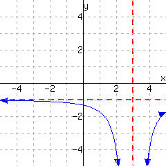
21.
A function is graphed.
What is its domain?
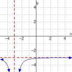
22.
A function is graphed.
What is its domain?
23.
A function is graphed.
What is its domain?
24.
A function is graphed.
What is its domain?
25.
A function is graphed.
This function has domain and range .
26.
A function is graphed.
This function has domain and range .
27.
A function is graphed.
This function has domain and range .
28.
A function is graphed.
This function has domain and range .
Graphing Technology.
29.
In a forest, the number of deer can be modeled by the function \(f(t)={\frac{360t+280}{0.9t+7}}\text{,}\) where \(t\) stands for the number of years from now. Answer the question with technology.
After 25 years, there would be approximately deer living in the forest.
30.
In a forest, the number of deer can be modeled by the function \(f(t)={\frac{120t+200}{0.6t+4}}\text{,}\) where \(t\) stands for the number of years from now. Answer the question with technology.
After years, there would be approximately 140 deer living in the forest.
31.
In a forest, the number of deer can be modeled by the function \(f(t)={\frac{140t+540}{0.4t+9}}\text{,}\) where \(t\) stands for the number of years from now. Answer the question with technology.
As time goes on, the population levels off at approximately deer living in the forest.
32.
The concentration of a drug in a patient’s blood stream, in milligrams per liter, can be modeled by the function \(C(t)={\frac{6t}{t^{2}+8}}\text{,}\) where \(t\) is the number of hours since the drug is injected. Answer the following question with technology.
The drug’s concentration after 1 hours is milligrams per liter.
33.
The concentration of a drug in a patient’s blood stream, in milligrams per liter, can be modeled by the function \(C\)m>, with \(C(t)={\frac{7t}{t^{2}+5}}\text{,}\) where \(t\) is the number of hours since the drug is injected. Use technology to complete the following sentence.
The drug’s concentration is 0.99 milligrams per liter hours after injection and then again hours after injection.
34.
The concentration of a drug in a patient’s blood stream, in milligrams per liter, can be modeled by the function \(C(t)={\frac{7t}{t^{2}+9}}\text{,}\) where \(t\) is the number of hours since the drug is injected. Answer the following question with technology.
hours since injection, the drug’s concentration is at the maximum value of milligrams per liter.
35.
The concentration of a drug in a patient’s blood stream, in milligrams per liter, can be modeled by the function \(C(t)={\frac{9t}{t^{2}+7}}\text{,}\) where \(t\) is the number of hours since the drug is injected. Answer the following question with technology.
As time goes on, the drug’s concentration in the patient’s blood stream levels off at approximately milligrams per liter.