Activity 13.7.1.
Try the Checkbox Choices app below. Fork the repl and change the code in Choices.java to add the RadioButtons using the code above.
JRadioButton—a button that belongs to a group of mutually exclusive alternatives. Only one button from the group may be selected at one time. The selection of software titles could be handled by a collection of checkboxes. A JCheckbox is a button that can be selected and deselected and that always displays its current state to the user. Using a checkbox will make it obvious to the user exactly what software has been selected.
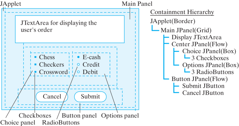
JTextArea again to serve as something of a printed order form. It will confirm the user’s order and display other messages needed during the transaction.

JPanel as the main container, instead of using the top window itself. The reason for this decision is that we want to use Swing Borders around the various JPanels to enhance the overall visual appeal of the design. The borders will have titles that help explain the purpose of the various panels.
JPanel we are using a \(3 \times 1\) GridLayout. The components in the main panel are the JTextArea and two other JPanel s. The GridLayout will take care of sizing these so they are all of equal size.
BoxLayout, which we will discuss later. This design leads to the most complex containment hierarchy thus far.
private ButtonGroup optGroup = new ButtonGroup();
private JCheckBox titles[] = new JCheckBox[NTITLES];
private JRadioButton options[] = new JRadioButton[NOPTIONS];
private String titleLabels[] =
    {"Chess Master - $59.95", "Checkers Pro - $9.95",
                           "Crossword Maker - $19.95"};
private String optionLabels[] = {"Credit Card",
             "Debit Card", "E-cash"};
for(int k = 0; k < titles.length; k++) {
    titles[k] = new JCheckBox(titleLabels[k]);
    titles[k].addItemListener(this);
    choicePanel.add(titles[k]);
  }
Converter program is that checkboxes generate ItemEvents instead ActionEvents. Therefore, each checkbox must be registered with an ItemListener (and, of course, the app itself must implement the ItemListener interface). We’ll show how ItemEvent is handled later.
for(int k = 0; k < options.length; k++) {
    options[k] = new JRadioButton(optionLabels[k]);
    options[k].addItemListener(this);
    optionPanel.add(options[k]);
    optGroup.add(options[k] );
  }
options[0].setSelected(true); // Set first button 'on'
ItemEvent s, so they too must be registered with an ItemListener. Note that the first button is set on, which represents a default payment option for the user.
ButtonGroup—here named optGroup—in order to enforce mutual exclusion among them. A ButtonGroup is an object whose sole task is to enforce mutual exclusion among its members. Whenever you click one radio button, the ButtonGroup will automatically be notified of this event and will turn off whatever other button was turned on. As Figure 13.7.2 illustrates, radio buttons are monitored by two different objects, a ButtonGroup, which manages the radio buttons’ states, and an ItemListener, which listens for clicks on the buttons and takes appropriate actions.

ButtonGroup object tracks each radio button’s state, ensuring that only one is selected at a time. The ItemListener listens for events on each button.optionPanel is a GUI component (a JPanel) that contains the button within the visual interface. Its role is to help manage the graphical aspects of the button’s behavior. The ButtonGroup is just an Object, not a GUI component. Its task is to monitor the button’s relationship to the other buttons in the group. Each object has a clearly delineated task.
JPanel that contains them. However, this would lead to all kinds of problems, not least of which is the fact that not everything in the container belongs to the same button group. So a clear division of labor is a much preferable design.
Border and BorderFactory classes can place borders around virtually any GUI element. Using borders is an effective way to make the grouping of components more apparent. Borders can have titles, which enhance the GUI’s ability to guide and inform the user. They can also have a wide range of styles and colors, thereby helping to improve the GUI’s overall appearance.
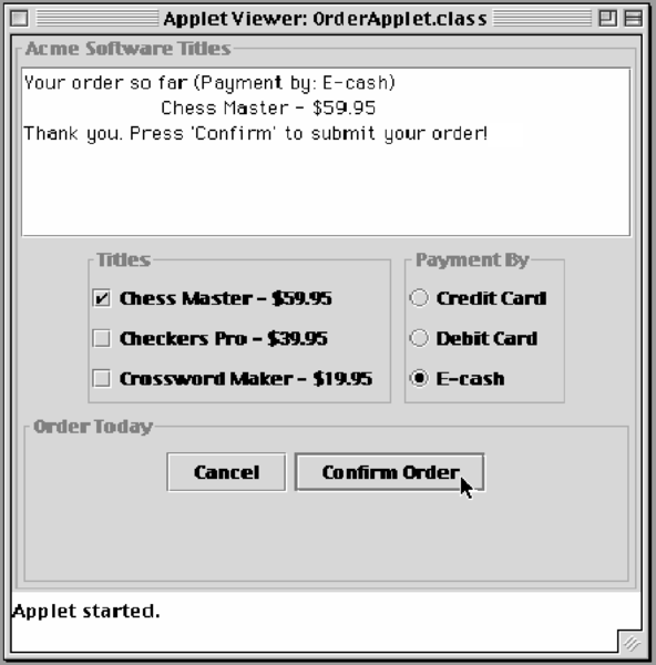
JComponent. For the Acme Software Titles interface, we place titled borders around four of the panels (Figure 13.7.4). The border on the main panel serves to identify the company again. The one around the button panel serves to group the two control buttons. The borders around both the checkbox and the radio button menus help to set them apart from other elements of the display and help identify the purpose of the buttons.

JPanel—is very simple. It takes one statement:
choicePanel.setBorder(
       BorderFactory.createTitledBorder("Titles"));
setBorder() method is defined in JComponent, is inherited by all Swing components, and takes a Border argument. In this case, we use the BorderFactory class to create a border and assign it a title. There are several versions of the static createTitledBorder() method. This version lets us specify the border’s title. It uses default values for type of border (etched), the title’s position (sitting on the top line), justification (left), and for font’s type and color.
Border and BorderFactory classes contain methods that let you exert significant control over the border’s look and feel. You can even design and create your own custom borders.
BoxLayout Manager
BoxLayout. This can be associated with any container, and it comes as the default with the Swing Box container. We use it in this example to arrange the checkboxes and radio buttons ( Figure 13.7.1).
BoxLayout is like a one-dimensional grid layout. It allows multiple components to be arranged either vertically or horizontally in a row. The layout will not wrap around, as does the FlowLayout. Unlike the GridLayout, the BoxLayout does not force all its components to be the same size. Instead, it tries to use each component’s preferred width (or height) in arranging them horizontally (or vertically). (Every Swing component has a preferred size that is used by the various layout managers in determining the component’s actual size in the interface.) The BoxLayout manager also tries to align its components’ heights (for horizontal layouts) or widths (for vertical layouts).
setLayout() method:
choicePanel.setLayout(new
             BoxLayout(choicePanel,BoxLayout.Y_AXIS));
BoxLayout() constructor has two parameters. The first is a reference to the container that’s being managed, and the second is a constant that determines whether horizontal (x-axis) or vertical (y-axis) alignment is used.
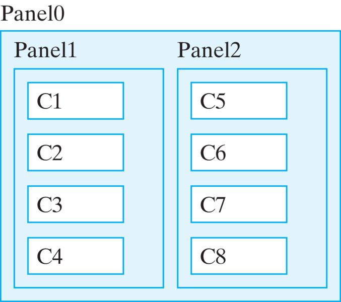
BoxLayout is that it can be used in combinations to imitate the look of the very complicated GridBoxLayout. For example, Figure 13.7.5 shows an example with two panels (Panel1 and Panel2) arranged horizontally within an outer box (Panel0), each containing four components arranged vertically. The three panels all use the BoxLayout. 
ItemListener Interface
ItemEvent is generated. ItemEvents are associated with items that make up menus, including JPopupMenu s, JCheckboxes, JRadioButton s, and other types of menus. Item events are handled by the ItemListener interface, which consists of a single method, the itemStateChanged() method:
public void itemStateChanged(ItemEvent e) {
  display.setText("Your order so far (Payment by: ");
  for (int k = 0; k < options.length; k++ )
    if (options[k].isSelected())
      display.append(options[k].getText() + ")\n");
  for (int k = 0; k < titles.length; k++ )
    if (titles[k].isSelected())
      display.append("\t" + titles[k].getText() + "\n");
  } // itemStateChanged()
options menu (radio buttons) to determine what payment option the user has selected. Since only one option can be selected, only one title will be appended to the display. The second loop iterates through the titles menu (checkboxes) and appends each title the user selected to the display. This way the complete status of the user’s order is displayed after every selection. The isSelected() method is used to determine if a checkbox or radio button is selected or not.
getItem(); // Returns a menu item within a menu
getItem() method is the ItemListener’s analogue to the ActionEvent’s getSource() method. It enables you to obtain the object that generated the event but returns a representation of the item that was selected or deselected.
extends ItemListener to the class and to add an itemStateChanged() method for the checkboxes using the code above.
OrderApp
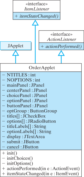
OrderApp is summarized in Figure 13.7.6 and its complete implementation is given in Listing 13.7.7. Try it in the activity below. JPanels are used to organize the components into logical and visual groupings. This conforms to the design shown in Figure 13.7.6. 
OrderApp classimport javax.swing.*;
import javax.swing.border.*;
import java.awt.*;
import java.awt.event.*;
public class OrderApp extends JFrame
implements ItemListener, ActionListener
{
private final int NTITLES = 3, NOPTIONS = 3;
private JPanel mainPanel = new JPanel(),
centerPanel = new JPanel(),
choicePanel = new JPanel(),
optionPanel = new JPanel(),
buttonPanel = new JPanel();
private ButtonGroup optGroup = new ButtonGroup();
private JCheckBox titles[] = new JCheckBox[NTITLES];
private JRadioButton options[] = new JRadioButton[NOPTIONS];
private String titleLabels[] =
{"Chess Master - $59.95", "Checkers Pro - $39.95",
"Crossword Maker - $19.95"};
private String optionLabels[] = {"Credit Card",
"Debit Card", "E-cash"};
private JTextArea display = new JTextArea(7, 25);
private JButton submit = new JButton("Submit Order"),
cancel = new JButton("Cancel");
public OrderApp() {
mainPanel.setBorder(BorderFactory.createTitledBorder(
"Acme Software Titles"));
mainPanel.setLayout(new GridLayout(3, 1, 1, 1));
cancel.addActionListener(this);
submit.addActionListener(this);
initChoices();
initOptions();
buttonPanel.setBorder(BorderFactory.createTitledBorder(
"Order Today"));
buttonPanel.add(cancel);
buttonPanel.add(submit);
centerPanel.add(choicePanel);
centerPanel.add(optionPanel);
mainPanel.add( display);
mainPanel.add(centerPanel);
mainPanel.add( buttonPanel);
getContentPane().add(mainPanel);
setSize(400,400);
setVisible(true);
}
private void initChoices() {
choicePanel.setBorder(
BorderFactory.createTitledBorder("Titles"));
choicePanel.setLayout(
new BoxLayout(choicePanel, BoxLayout.Y_AXIS));
for (int k = 0; k < titles.length; k++) {
titles[k] = new JCheckBox(titleLabels[k]);
titles[k].addItemListener(this);
choicePanel.add(titles[k]);
}
} // initChoices()
private void initOptions() {
optionPanel.setBorder(
BorderFactory.createTitledBorder("Payment By"));
optionPanel.setLayout(
new BoxLayout(optionPanel, BoxLayout.Y_AXIS));
for (int k = 0; k < options.length; k++) {
options[k] = new JRadioButton(optionLabels[k]);
options[k].addItemListener(this);
optionPanel.add(options[k]);
optGroup.add(options[k]);
}
options[0].setSelected(true);
} // initOptions()
public void itemStateChanged(ItemEvent e) {
display.setText("Your order so far (Payment by: ");
for (int k = 0; k < options.length; k++ )
if (options[k].isSelected())
display.append(options[k].getText() + ")\n");
for (int k = 0; k < titles.length; k++ )
if (titles[k].isSelected())
display.append("\t" + titles[k].getText() + "\n");
} // itemStateChanged()
public void actionPerformed(ActionEvent e){
String label = submit.getText();
if (e.getSource() == submit) {
if (label.equals("Submit Order")) {
display.append(
"Thank you. Press 'Confirm' to submit your order!\n");
submit.setText("Confirm Order");
} else {
display.append(
"Thank you. You will receive your order tomorrow!\n");
submit.setText("Submit Order");
}
} else
display.setText(
"Thank you. Maybe we can serve you next time!\n");
} // actionPerformed()
} // OrderApp
initChoices() and initOptions() methods, respectively.
actionPerformed() method creates a mock order form in the display area. This allows the user to review the order before it is submitted. Also note that the algorithm used for submittal requires the user to confirm an order before it is actually submitted. The first time the user clicks the Submit button, the button’s label is changed to, “Confirm Order,” and the user is prompted in the display area to click the Confirm button to submit the order. This design allows the interface to catch inadvertent button clicks.