Scatter Plots
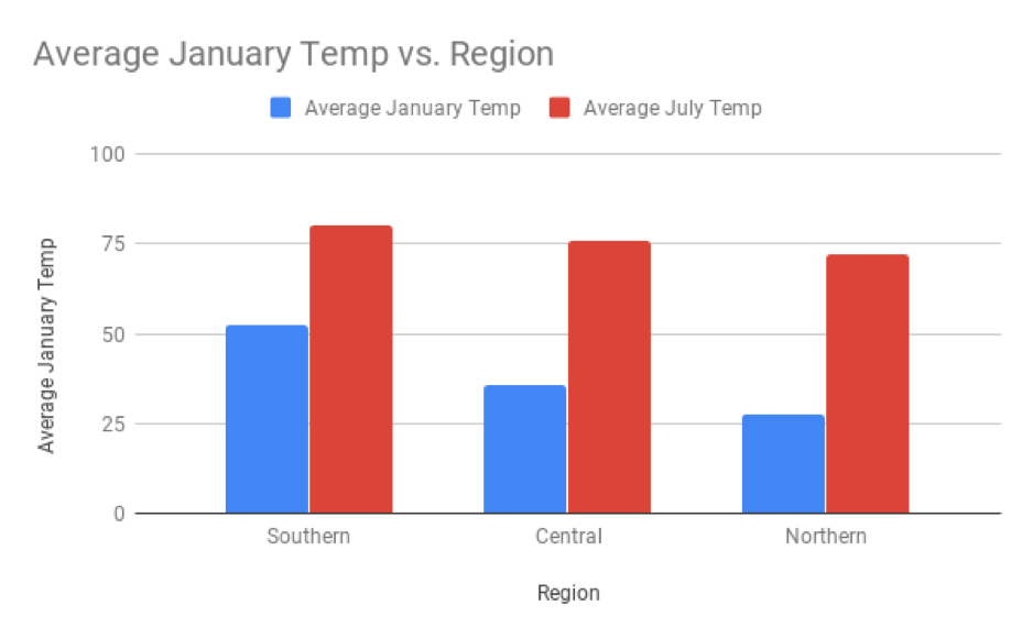
Charleston, South Carolina, which has a latitude of 33 degrees, is not included in this weather dataset. If you were asked to predict average January temperatures there, you might make a good guess and say 52 degrees F, because that is the mean temperature for southern cities with a latitude below 35. This was found using the bar chart that you saw in the introduction:

The problem with this prediction is that it is the same for the entire Southern region - that’s a lot of cities! Could you make a better prediction using the exact latitude of Charleston?
One way to have a more accurate prediction would be to create more than three categories for regions. For example, you could have a group for latitudes between 25 and 26 degrees, for 26 to 27 degrees, and so on. By using cities with very similar latitudes, you could make a more accurate prediction of Charleston’s temperature. However, it would be tedious to create so many groups. Rather than converting latitude to buckets of variables (aka a categorical variable), you could use latitude as a quantitative variable.
Scatter plots show the relationship between two quantitative variables. The variable on the x-axis is called the explanatory variable. The variable on the y-axis is called the explained variable, because it is being explained by the explanatory variable.
There are many synonyms for these terms, and the term used varies between different texts and disciplines.
The variable on the x-axis can be called the independent variable. The variable on the y-axis is then called the dependent variable, as it depends on the independent variable.
The variable on the x-axis can be called the predictor variable. The variable on the y-axis is then called either the response variable or the predicted variable, as it is being predicted by the predictor variable.
To make it easier, this textbook will only use the terms “explanatory” and “explained” variables.
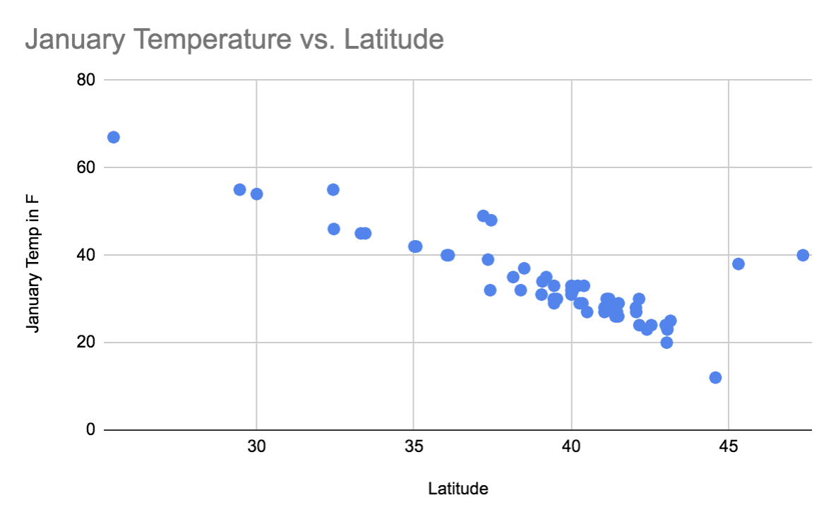
In the graph below, latitude is the explanatory variable and mean January temperature is the explained variable. Each city is represented as a point, where the x-coordinate of each point is that city’s latitude, and the y-coordinate of each point is that city’s mean January temperature.

Using the scatter plot, you might predict that the January temperature in Charleston would be between 45 and 50 degrees F, based on the temperatures for cities with similar latitudes. The actual January temperature in Charleston is 50 degrees F, so this prediction is more accurate than the 52 degrees F predicted from the bar chart.
Q-1: Why did the scatter plot produce a more accurate prediction than the bar chart?
The city of Juneau, Alaska has a latitude of 58 degrees. Because there are no other cities in the dataset with similar latitudes, it is not possible to make a reliable guess about the January temperature in Juneau. Trying to make a prediction about values not represented by your data is called extrapolation, and predictions made in this way are considered unreliable.