
Introduction
In the last section, you learned that correlation in scatter plots measures the linear relationship between two quantitative variables. The closer the coefficient of determination (or \(R^2\) value) is to 1, and the closer the points of the scatter plot are to a straight line, the more reliable your predictions will be. But what does this line actually mean and how can it help you make predictions?
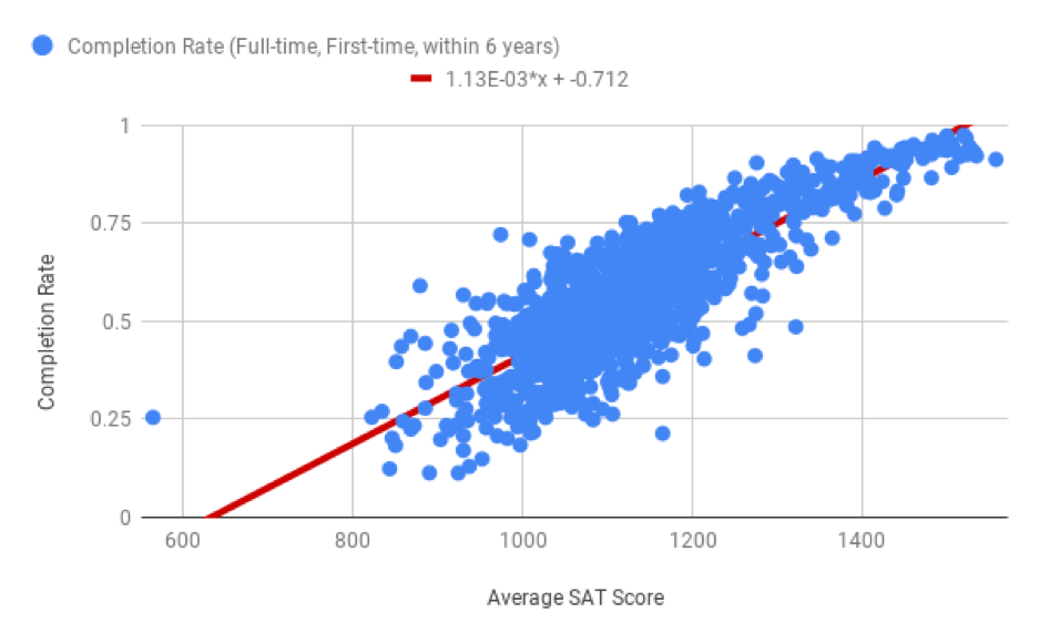
This line is called the line of best fit, or a regression line. This line can be used to predict information about values that you may not have data for. A line of best fit for a scatter plot could look something like the following.
In this section, you’ll learn how to create a line of best fit in Sheets, use the equation of the line of best fit to make predictions, and explain how changes in one variable may impact the other. Here are some questions a line of best fit helps to answer.
If a school has an average SAT score of 1200, what is its predicted completion rate?
If two schools have a difference of 100 points in average SAT score, will their graduates make different salaries after graduation? If so, by how much?
How does the percentage of students receiving federal loans impact completion rates?
You will work through some examples throughout this section to find answers to these questions.