
Section 2.1 Investigation 1.1: Friend or Foe?

In a study reported in the November 2007 issue of Nature, researchers investigated whether infants take into account an individual’s actions towards others in evaluating that individual as appealing or aversive, perhaps laying the foundation for social interaction (Hamlin, Wynn, and Bloom, 2007). In other words, do children who aren’t even yet talking still form impressions as to someone’s friendliness based on their actions?
In one component of the study, sixteen 10-month-old infants were shown a “climber” character (a piece of wood with “googly” eyes glued onto it) that could not make it up a hill in two tries.

Aside: Video Demonstrations.

Then the infants were shown two scenarios for the climber’s next try, one where the climber was pushed to the top of the hill by another character (the “helper” toy) and one where the climber was pushed back down the hill by another character (the “hinderer” toy). The infant was alternately shown these two scenarios several times.
Then the child was presented with both pieces of wood (the helper and the hinderer characters) and asked to pick one to play with.
Infant choosing between helper and hinderer toys

Collecting the Data.

Definitions: Sample and Sample Size.

A sample is a collection of observed outcomes generated by repeated realizations a random process. The set of observations should reflect the typical behavior, and the variability inherent in that process. A study’s sample size is the number of outcomes observed.

Checkpoint 2.1.1. Identify the Sample.

Identify the sample in this study.
Hint.
The sample consists of the observational units from which data were collected.
Answer.
The sample is the observations from the 16 infants.

Checkpoint 2.1.2. Assess Independence Assumption.

Do you think it is reasonable to model these observations as independent realizations of the random process under “identical conditions”? Explain.
Hint.
Consider whether the infants can be viewed as interchangeable and whether each infant’s choice was measured separately.
Answer.
Opinions will vary, but if we consider the infants as interchangeable (no differences between them) and the infants’ choices were all measured separately, that this modeling assumption seems appropriate. In particular, we need to be willing to model each infant as having the same probability of picking the helper toy.

Checkpoint 2.1.3. Explain Experimental Controls.

Why is it important that the researchers varied the colors and shapes of the wooden characters and even on which side the toys were presented to the infants?
Hint.
Think about other factors besides the helping/hindering behavior that might influence an infant’s choice.
Answer.
This is to control for (or at least balance out) any other factors that could be influencing the infants’ choices.

Definition: Variables.

The measurements we are taking define the variable. We classify the type of variable as categorical (assigning each observational unit to a category) or quantitative (assigning each observational unit a numerical measurement). A special type of categorical variable is a binary variable, which has just two possible outcomes (often labeled “success” and “failure”).

Checkpoint 2.1.4. Identify the Variable.

What is the variable we are measuring about each observation?
Hint.
Think about what information is recorded for each infant.
Answer.
Variable = which toy does the infant choose to play with.

Checkpoint 2.1.5. Classify Variable Type.

Is this variable quantitative or categorical?
  • Categorical
  • Correct! The variable records which category (Helper or Hinderer) each infant chose, making it a categorical variable.
  • Quantitative
  • Not quite. A quantitative variable would be a numerical measurement. Here we’re recording which toy was chosen, which is a category.
Hint.
Think about whether the data is a number or a category.

Definition: Research Question.

A research question often looks for patterns in a variable or compares a variable across different groups or looks for a relationship between variables.

Checkpoint 2.1.6. State Research Question.

What research question is of interest here?
Hint.
What question are the researchers trying to answer about infant behavior?
Answer.
The research question is whether infants in general (assuming identical infants from a random process) are more likely to pick the helper toy than the hinderer toy in the long run.

Summarizing the Observed Data.

To summarize the distribution of a categorical variable, we can simply count how many are in each category and make a bar graph to display the results, one bar for each outcome, with heights representing the number of observations in each category, separating the bars to indicate distinct categories.

Checkpoint 2.1.7. Create Bar Graph.

The “raw data” can be found on the course webpage as a txt file (InfantData.txt). How many do you see of each possible outcome? Sketch the bar graph. Give your graph an “active title,” a concise sentence stating the main message/key takeaways from the graph.
Hint.
Count how many infants chose each toy. A bar graph should have bars for each category (Helper and Hinderer) with heights representing the counts.
Answer.
14/16 = 0.875
Active title: A majority of infants preferred the helper toy.
Bar graph showing 14 infants chose Helper toy and 2 chose Hinderer toy

Technology Detour - Loading in a Data File.

Checkpoint 2.1.8. Loading Data - RStudio.
In RStudio, choose Import Dataset > From Text (readr) and enter the URL, then press Import.
Note 2.1.9. RStudio Reminder.
With other data files, you may need to consider how “missing values” are coded. The Import Dataset dialog gives you a preview so you can check that the data looks correct before importing.
Solution.
After importing, you should see the data appear in your Environment pane (upper right) and a data viewer window will open showing the contents of the file. The data table should show one column named choice with 16 rows containing either "Helper" or "Hinderer".
Checkpoint 2.1.10. Loading Data - R.
Loading from URL (In RStudio)
If you’re using RStudio on your computer, you can load the InfantData.txt file directly from the web using the url() function:
InfantData = read.table(url("https://www.rossmanchance.com/iscam3/data/InfantData.txt"), header=TRUE)
The header=TRUE argument indicates the first row contains variable names.
Loading from Your Computer
If you’ve downloaded the InfantData.txt file, use file.choose() to browse for it:
InfantData = read.table(file.choose(), header=TRUE)
For This Interactive Textbook (Sage Cell)
Since the Sage cells in this textbook cannot access external URLs, we’ll create the data directly. Click “Evaluate (R)” below to load and view the Infant data:
Note 2.1.11. Working with Sage Cells.
Important: Each Sage cell runs completely independently in this textbook. Variables created in one cell are not available in other cells. This is why you’ll see the data creation code repeated in each cell throughout this investigation - each cell includes all the previous steps plus the new command you’re learning.
Building Your Analysis: As you progress through the investigation, each cell will include:
  • All the previous commands (like creating the data)
  • PLUS the new command for that step
This way, you can run any cell at any time without having to go back and re-run earlier cells.
How to Use: Click the “Evaluate (R)” button below each code cell to run the R code. You should see output appear in a green-bordered box below. You can also click the expand icon (↗) in the upper right to open the cell in a larger editor window.
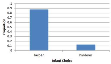
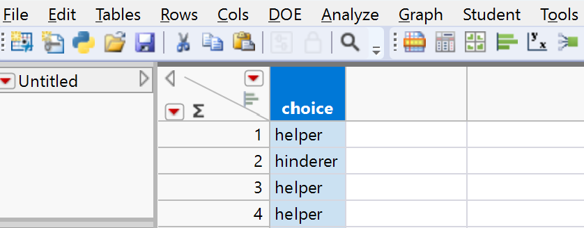
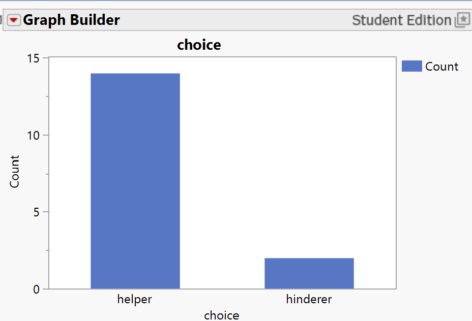
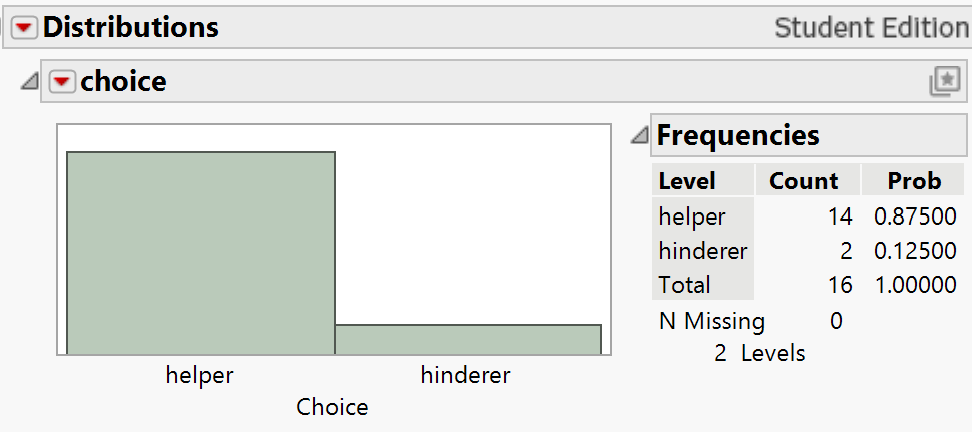
You should see output showing the data with 16 rows and one column called choice. Verify that you see both "Helper" and "Hinderer" values.
Or you need to clarify to R which datafile you are using (e.g., InfantData$choice).
Other Input Options
Depending on how the data you are pasting is formatted, you may need additional arguments:
  • sep="\t" - separated by tabs
  • na.strings="*" - how to code missing values
  • strip.white=TRUE - strip extra white space
Note 2.1.12. R Reminder.
R is case sensitive! InfantData and infantdata are different objects. Always check your data after loading with View() or head() to make sure it loaded correctly. Using attach() lets you reference column names directly, but be careful - if you have multiple datasets loaded, this can cause confusion.
Solution.
After running head(InfantData), you should see output similar to:
 choice
1    Helper
2    Helper
3    Helper
4    Helper
5    Helper
6  Hinderer
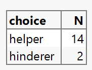
This shows the first 6 observations of the data. The full dataset contains 16 observations total.
Checkpoint 2.1.13. Loading Data - JMP.
Method 1: Copy and Paste
Choose File > New > Data table. Open the InfantData.txt (raw data) link from the data files page and select all the observations and the variable name and copy the data into the clipboard. Return to the data table in JMP and select Edit > Paste with Column Names.
Method 2: Open File
If the .txt file is saved on your computer, you can choose File > Open and use the pull-down menu to change the file type.
Note 2.1.14. JMP Reminder.
When using Paste with Column Names, make sure you include the header row (variable names) in your selection. JMP will automatically detect the data types for each column. Always check the data table after importing to ensure everything looks correct.
Solution.
After pasting or opening the file, you should see a data table with one column labeled choice containing 16 rows. The column should be recognized as a Character data type. The values should alternate between "Helper" and "Hinderer" entries.
JMP data table showing the choice column with 16 rows of Helper and Hinderer values

Technology Detour - Tallying the Outcomes.

Checkpoint 2.1.15. Tallying the Outcomes - R.
To count the number of correct and incorrect responses:
You should see output showing: Helper 14, Hinderer 2
Note 2.1.16. R Reminder.
The table() function automatically counts the frequency of each unique value in your data. Make sure your data is loaded before running this command.
Solution.
The output should show:
choice
  Helper Hinderer 
  14        2
This indicates that 14 infants chose the Helper toy and 2 chose the Hinderer toy.
Checkpoint 2.1.17. Tallying the Outcomes - JMP.
Choose Analyze > Tabulate. In the new window, drag the choice column to either the Drop Zone for columns or for rows. Press Done.
JMP Tabulate window showing counts: Helper 14, Hinderer 2
Note 2.1.18. JMP Reminder.
Look for the red triangle (“hot spot”) menus in JMP windows - they provide additional options and actions. Dragging variables to different zones (rows vs. columns) changes how your table is organized.
Solution.
The Tabulate output should display a table showing the counts for each category:
The exact layout depends on whether you placed the variable in rows or columns, but the counts will be the same.
JMP frequency table showing choice categories and their counts

Technology Detour - Bar Graphs.

Checkpoint 2.1.19. Bar Graphs - R (raw data).
You need to pass the tabled data into the barplot function:
The bar graph should appear directly below. You should see two bars - one tall bar for Helper (14) and one short bar for Hinderer (2).
Note 2.1.20. R Reminder.
The xlab and ylab arguments add labels to your axes. Always label your graphs to make them interpretable! You can nest the table() function inside barplot() to go directly from raw data to a graph.
Solution.
You should see a bar graph with two bars:
  • A bar for "Helper" with height 14
  • A bar for "Hinderer" with height 2
The x-axis should be labeled "Choice" and the y-axis should be labeled "Frequency". The bars should have gaps between them to indicate these are categorical data.
Checkpoint 2.1.21. Bar Graphs - R (summary data).
If you already (or only) have the summarized data (the number of successes and failures), you can type:
The bar graph should appear directly below showing the same pattern as before.
Note 2.1.22. R Reminder.
The c() function creates a vector (list) of values. The names.arg parameter assigns category labels to each bar. The order matters - the first count gets the first label!
Solution.
You should see a bar graph identical to the one created from raw data:
  • A bar labeled "Helper" with height 14
  • A bar labeled "Hinderer" with height 2
This method is useful when you only have summary statistics rather than the full dataset.
Checkpoint 2.1.23. Bar Graphs - JMP (summary data).
Method 1: From Tabulate Window
In the Tabulate window (from above), use the red down arrow in the upper left corner (“hot spot”) and select Show Chart. Best when using the Drop zone for rows.
JMP Tabulate window with Show Chart option
Method 2: Graph Builder
If you have the categories and counts in a data window, choose Graph > Graph Builder. Drag the variable names to the x-axis and the counts to the y-axis. Press the 7th icon to convert the chart to a bar graph.
JMP Graph Builder interface for creating bar graphs from summary data
Note 2.1.24. JMP Reminder.
Graph Builder is JMP’s most flexible graphing tool. The icons at the top let you switch between different graph types. Drag and drop variables to different zones to change what the graph displays.
Solution.
You should see a bar graph showing two bars with the frequency counts clearly labeled. The Helper bar should be noticeably taller (14) than the Hinderer bar (2). The graph should automatically include axis labels and a legend if needed.
JMP bar graph created from summary data showing Helper and Hinderer counts
Checkpoint 2.1.25. Bar Graphs - JMP (raw data).
Method 1: Graph Builder
From the Data Table window, select Graph > Graph Builder. Drag the Choice variable to the X-axis. Hover until the X-region shows the group labels and then let go. Press the 7th (“Bar”) icon to convert the chart to a bar graph.
JMP Graph Builder showing dragging variable to X-axis
JMP Graph Builder with Bar chart icon selected
Method 2: Distribution Platform
Choose Analyze > Distribution. With the choice column highlighted, press the Y, Columns button (or drag to the white box). Press OK.
JMP Distribution output with frequency chart
You have lots of options here (using the hot spots), like turning the graph horizontal, adding an axis (putting it on the left), adding labels, separating bars, etc.
JMP Distribution hot spot menu options
Note 2.1.26. JMP Reminder.
The Distribution platform is great for exploring categorical data. Use the red triangle hot spots to customize your graph - you can make bars horizontal, add counts/percentages, change colors, and more. Experiment with the options to make your graph publication-ready!
Solution.
Either method should produce a bar graph showing the distribution of choices. You should see:
  • Two distinct bars for Helper and Hinderer
  • The Helper bar should be approximately 7 times taller than the Hinderer bar (14 vs 2)
  • Frequency counts labeled on or near the bars
  • Clear axis labels and category names
Using the Distribution platform gives you more statistical output beyond just the graph, including percentages and other summary statistics.
JMP bar graph showing Helper and Hinderer distribution

Drawing Conclusions Beyond the Sample.

Clearly a majority/more than half of the infants chose the helper toy in this sample of 16 infants. But does that convince us that infants in general are more likely to pick the helper toy in the long run? In other words, what is the probability that an infant will choose the helper toy?
Model assumption: Note we are assuming each infant has the same probability of picking the helper toy, we just don’t know the value of that probability.

Checkpoint 2.1.27. Researchers’ Hypothesis.

What do the researchers think is true about the value of this probability (e.g., do they think it is larger or smaller than 0.50)?
  • Larger than 0.50
  • Correct! The researchers hypothesize that infants prefer the helper toy, which would mean the probability of choosing the helper is greater than 0.50.
  • Smaller than 0.50
  • Not quite. If infants preferred the hinderer toy, the probability would be less than 0.50, but that’s not what the researchers think.
  • Equal to 0.50
  • Not quite. A probability of 0.50 would mean infants choose equally between the two toys, which is not the researchers’ hypothesis.
Hint.
Consider what the research hypothesis is about infant preferences for the helper toy.

Checkpoint 2.1.28. Consider Chance Explanation.

Is it possible that in the long run infants just choose equally between the two toys (e.g., the probability an infant will choose the helper toy is 0.5) and we just happened to see more than half choose the helper toy in our sample?
  • Yes
  • Correct! It’s possible that the true probability is 0.50 and we just observed an unusual sample by chance.
  • No
  • Actually, it is possible. Random samples can vary, and we might see more than half choose the helper toy even if the true probability is 0.50.

Checkpoint 2.1.29. Rule Out Color Preference.

Is it plausible that the observed majority occurred because infants just prefer the color blue?
  • Yes
  • Not quite. The researchers varied the colors, shapes, and positions of the toys to balance out these factors, so color preference is not a plausible explanation.
  • No
  • Correct! We are not considering color, shape, or position as the explanation because these factors were balanced in the design of the study.
Hint.
Recall why the researchers varied colors, shapes, and positions.
So that leaves us with two explanations for the majority we observed:
  1. There is something to the theory that infants are genuinely more likely to pick the helper toy (for some reason).
  2. Infants choose equally between the two toys in the long run and we happened to get “lucky” and had an unusual sample where most of the infants in our sample picking the helper toy.

Checkpoint 2.1.30. Choose Between Explanations.

So for the two possibilities we are still considering, how might you choose between them? In particular, how might you convince someone whether or not option (2) is plausible based on this study?
Hint.
Think about what makes an outcome unusual or typical when choices are made randomly.
Answer.
We would need to convince someone that if these results were just happening "randomly," it would be unusual to get 14 infants picking the helper toy.
Our analysis approach is going to be to assume the second explanation is true (similar to how in a legal trial we assume a defendant is innocent), and then see whether our data are consistent or inconsistent with that assumption. To do this, we need to investigate the values we expect to see for the number choosing the helper toy when 16 infants are equally choosing between the two toys. As you saw with the Random Babies (Investigation B), we can simulate the outcomes of a random process to help us determine which outcomes are more or less likely to occur.

Checkpoint 2.1.31. Design a Simulation.

Suggest a method for carrying out a simulation of 16 infants picking equally between the two toys.
Hint.
Think about a simple physical randomization device that gives two equally likely outcomes.
Answer.
We could toss a coin for each infant, letting heads represent choosing the helper toy and tails represent choosing the hinderer toy. This makes the two choices equally likely on each toss. Then use 16 coins or toss one coin 16 times to represent the 16 infants. (We are assuming these are equivalent, that the observational units are identical.) These results will help us assess the variability in the outcomes of 16 infants "just by chance." This will help us decide whether 14 is a typical outcome or an unusual outcome when we know for a fact that the "infants" choose equally (in the long run) between the two toys.

Simulation.

For a 50-50 simulation model, we can flip a fair coin. We can arbitrarily define “heads” to be choosing the helper toy and “tails” to be choosing the hinderer toy. We will repeat the random process 16 times to represent the 16 infants, and we will count how many times we flip heads, representing an infant choosing the helper toy. The chart below shows this mapping of the real world, which we saw one instance of, and the simulation model, which we can easily repeat many times. Keep in mind that in the simulation model, we know the probability of heads is 0.50.
Table 2.1.32. Mapping real world to simulation model
Real world Simulation model
One observation Infant choice Coin toss
Sample 16 infants 16 coin tosses
Success Picks helper toy Lands heads
Probability of “success” Unknown 0.50

Checkpoint 2.1.33. Conduct Coin Toss Simulation.

Flip a coin 16 times, representing the 16 infants in the study (one repetition of this random process). Tally the results below and count how many of the 16 chose the helper toy:
“Could have been” outcomes
Heads (helper toy):
Tails (hinderer toy):
Total number of heads in 16 tosses:
Hint.
Flip a coin 16 times and count the number of heads and tails. The totals should add to 16.
Answer.
Results will vary by class. Below is one possible set of results:
Dotplot showing distribution of class simulation results for number of heads in 16 coin tosses

Checkpoint 2.1.34. Combine Class Results.

Combine your simulation results for each repetition with your classmates’ on the scale below. Create a dotplot by placing a dot above the numerical result found by each person’s set of 16 tosses.
Hint.
Each person in class should contribute one dot to the class dotplot, placed above their number of heads out of 16.
Answer.
Results will vary by class. See image in the previous exercise for an example dotplot.

Checkpoint 2.1.35. Describe Simulation Variability.

Did everyone get the same number of heads every time? What is an average or typical number of heads in a set of 16 tosses? Is this what you expected? Explain.
Hint.
Look at the center of the dotplot. What value appears most frequently or is in the middle of the distribution?
Answer.
No, there will be variability across the sets of 16 tosses, but 8 heads is an average or typical number of heads.

Checkpoint 2.1.36. Assess Unusualness.

Does 14 heads appear to be an unusual outcome for 16 observations from a process where heads should appear 50% of the time in the long run?
Hint.
Look at your class dotplot. How often did values as extreme as 14 (or more) occur? Is 14 in the "tail" or center of the distribution?
Answer.
Answers will vary, but 14 does appear to be somewhat unusual, not occurring very often, in the "tail" of the distribution.
We really need to simulate this hypothetical random selection process hundreds, preferably thousands of times. This would be very tedious and time-consuming with coins, so let’s turn to technology.

Checkpoint 2.1.37. Simulate Using Technology.

Use the One Proportion Inference applet to simulate these 16 infants making this helper/hinderer choice, still assuming that infants have no real preference and so are equally likely to choose either toy.
  • Keep the Probability of heads set to 0.5.
  • Set the Number of Tosses to 16.
  • Keep the Number of repetitions at 1 for now.
  • Press Draw Samples.
Report the number of heads (i.e., the number of infants who choose the helper toy) for this “could have been” (under the assumption of no preference) outcome.
Number of heads:
Hint.
The applet will simulate flipping 16 coins and count the number of heads for you automatically.
Answer.
Results will vary.

Checkpoint 2.1.38. Repeat Simulation Multiple Times.

Uncheck the Show animation box and press Draw Samples four more times, each time recording the number of the 16 infants who choose the helper toy. Did you get the same number of heads all five times?
  • Yes
  • Actually, random processes typically produce different results each time. You should see variation in the number of heads across the five repetitions.
  • No
  • Correct! There should be variation in the results across the repetitions. This variability is a natural characteristic of random processes.
Hint.
Each repetition simulates a new set of 16 coin flips. Think about whether random processes produce identical results every time.

Checkpoint 2.1.39. Generate Null Distribution.

Now change the Number of repetitions to 1995 and press Draw Samples, to produce a total of 2,000 repetitions of this random process of tossing a coin 16 times. For the dotplot you have created, what does each dot represent (i.e., what would you need to do to add another dot to the graph)?
Hint.
Think about what you did to create one dot in the physical coin-flipping activity.
Answer.
Each dot in the dotplot represents the number of heads in 16 coin tosses (representing the choices of a set of 16 infants).

Checkpoint 2.1.40. Classify Graph Variable.

Is the graph variable (number of heads) quantitative or categorical?
  • Quantitative
  • Correct! The variable "number of heads" is quantitative because it represents a numerical count that can be measured and has meaningful numerical values.
  • Categorical
  • Not quite. The number of heads is a count (0, 1, 2, ..., 16), which makes it quantitative rather than categorical. Categorical variables assign observations to categories, not numerical values.
Hint.
What does the horizontal axis represent? Is it counting something or assigning categories?

Checkpoint 2.1.41. Draw Conclusion.

Now that we have a better picture of the long-run behavior of this process, discuss whether you would consider option 2 before (j): “Infants choose equally between the two toys in the long run and we happened to get ’lucky’ and find most of the infants in our sample picking the helper toy” to be a plausible conclusion for this study. Explain your reasoning as if to a skeptic.
Hint.
Look at how often 14 or more heads occurred in your 2,000 simulated repetitions. Is this common or rare? What does this tell you about the plausibility of the "no preference" assumption?
Answer.
Because it is very unlikely for us to have seen results at least as extreme as what we observed (14 successes) under the assumption of 50-50 chance, we have evidence against this claim and instead in favor of the claim that there is something other than random chance at play in this sample.

Discussion.

Returning to our legal trial analogy, if you decide that the observed “data” is unlikely to occur by chance alone, you are going to “reject” the assumption of “innocence” (and say we have evidence the defendant is guilty). If you decide the data/evidence is not unusual by chance alone, then you “fail to reject” that assumption (and we say we don’t have evidence the defendant is guilty — we aren’t proving the defendant innocent, just that the evidence is not inconsistent with that assumption, “not guilty”).
So based on these simulation results, we would say the data (14 helper choices out of 16 trials) is unusual under the assumption that infants genuinely have no preference and are choosing blindly when presenting the toys. This evidence convinces us that “There is something to the theory that infants are genuinely more likely to pick the helper toy (for some reason)” is the more believable explanation for why so many of the infants in this study picked the helper toy over the hinderer toy. We haven’t proven this is true, but based on the strong majority these researchers saw, even for this small sample size of 16, we would consider the evidence convincing (“beyond a reasonable doubt”) that, in the long run, the probability of choosing the helper toy in this random process is greater than 0.5. Because the researchers controlled for other possible explanations for the observed preference results like color and handedness, we will conclude that there is convincing evidence that infants really do have a genuine preference for the helper toy over the hindering toy.

Study Conclusions.

In a study of “social evaluation,” researchers explored whether pre-verbal infants have a preference for a “helping” toy over a “hindering” toy. Treating the 16 infants as identical observations from a random process with equal probability of success/failure, we find that getting 14 infants choosing the helper toy is not consistent with the types of values we expect to see when we have “infants” choosing equally between the two toys. This means that the researchers’ data provide strong statistical evidence to reject this “no preference” model and conclude that the infants’ choices are actually governed by a process where there is a genuine preference for the helper toy (or at least that it’s more complicated than each infant flipping a coin to decide). Of course, this conclusion depends on the assumption of “identical infants” and that these 16 infants’ choices are representative of the larger process of viewing the videos and selecting a toy. Also keep in mind that not all infants had a clear preference for either object.

Subsection 2.1.1 Practice Problem 1.1A

In a second experiment, the same events were repeated but the object climbing the hill no longer had the googly eyes attached. The researchers wanted to see whether the preference was made based on a social evaluation more than a perceptual preference. Suppose 8 of 12 (different) infants chose the push-up toy.

Checkpoint 2.1.42. Determine Sample Size for Simulation.

If you were to use a coin to carry out a simulation analysis to evaluate these results: how many times would you flip the coin for one repetition — 6, 8, 10, 12, 16, or 1000?
  • 6
  • Not quite. Think about how many infants were in this experiment.
  • 8
  • Close, but this is the number who chose the push-up toy, not the total number of infants.
  • 10
  • Not quite. Check the problem statement for the total number of infants in the experiment.
  • 12
  • Correct! You need to flip the coin 12 times to represent the 12 different infants in this experiment, just like we flipped 16 times to represent the 16 infants in the original study.
  • 16
  • Not quite. That was the sample size in the original study, but this experiment has a different number of infants.
  • 1000
  • Not quite. 1000 would be the number of repetitions we might do, not the number of coin flips per repetition.
Hint.
How many infants participated in this second experiment? Each coin flip represents one infant’s choice.

Checkpoint 2.1.43. Evaluate Evidence Without Eyes.

Use the One Proportion Inference applet to decide whether it is plausible that when the googly eyes are removed infants do not have a genuine preference between the two toys. What do you conclude?

Subsection 2.1.2 Practice Problem 1.1B

In 2019, the home team won 54 of the first 88 games of the Premier Soccer League season. Consider these games as a sample from a random process (all games that could have occurred in first 3 months).

Checkpoint 2.1.44. Model the Soccer Process.

Could we use a coin tossing simulation to model this random process? What would each coin toss represent? What are we assuming about the process? How many times would we toss the coin for one repetition? Define what is meant by “probability of success” in this context.

Checkpoint 2.1.45. Test Home Field Advantage.

Use the One Proportion Inference applet to decide whether these data provide convincing statistical evidence that the home team is more likely than the visiting team to win in the long run. Justify your conclusion.

Checkpoint 2.1.46. Test Home Advantage Without Fans.

At the beginning of the 2020 season, fans were not allowed at the games due to the Coronavirus pandemic. For the first three months of this season, the home team won 40 of 87 matches. Decide whether these data provide convincing statistical evidence that the home team is more likely than the visiting team to win when no fans are present. Justify your conclusion.
You have attempted of activities on this page.